Tasked with analyzing two pages from David Small’s “Stitches” and Tillie Walden’s “Spinning” and a deadline to boot, my most mournful reflection is that I incorrectly assessed the due date to be a whole 24 hours earlier than it was; as such, my loss of sleep is a slightly less-noble sacrifice than I previously assumed.
At first I thought I was going to have trouble meeting the minimum word-count, but I was pleasantly surprised to find that I actually had more than enough sentences to supplement my essay. The issue I had came instead from cutting down and streamlining my muddle of wordy words to fit the word maximum. I will admit though that this problem is a decidedly more helpful “hindrance” than not having enough, for when you’re forced to trim the fat, what’s left is only grade-A meat (I hope!).
Tracing out the pages helped me realize a lot more about the techniques inside each page and appreciate the work a graphic novelist puts into planning and preparation for their final production. Moreover, the sheer multitude of possibilities one faces when plotting out a page is both astonishing and exciting, so I guess something should be said for the wonderment that comes from a blank sheet of paper. What an endless array of opportunities!
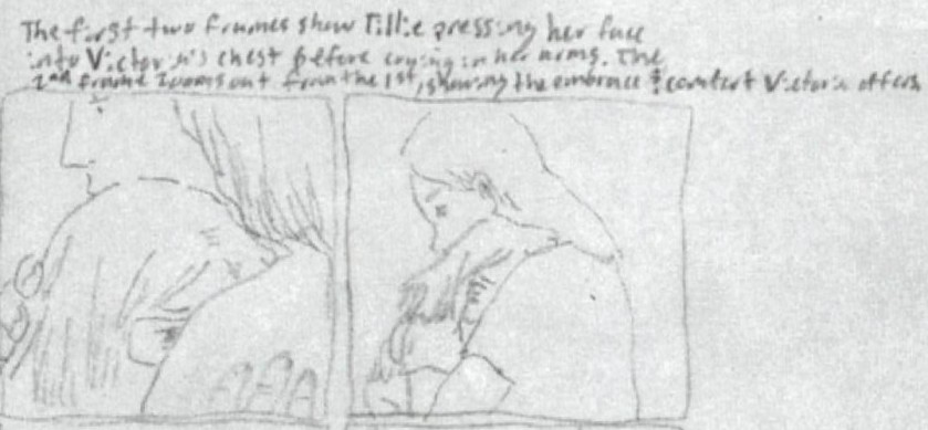
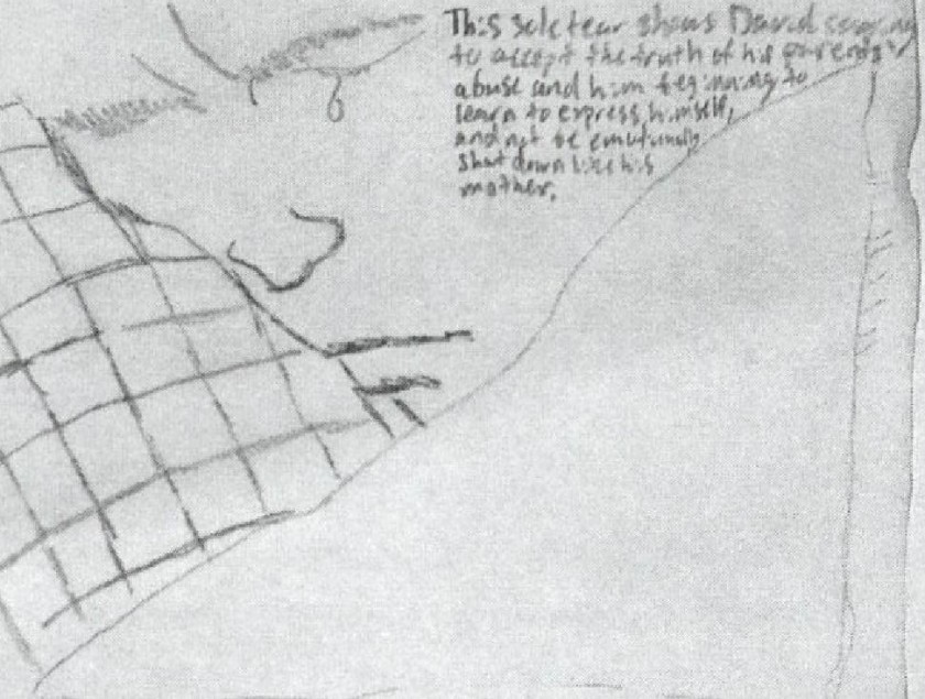
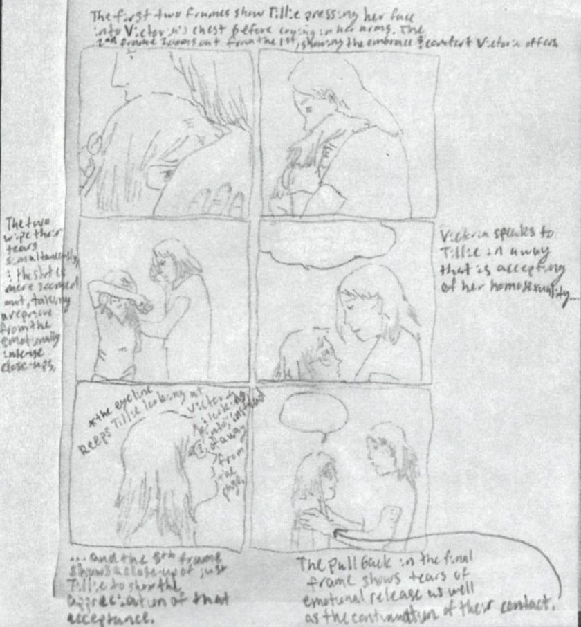
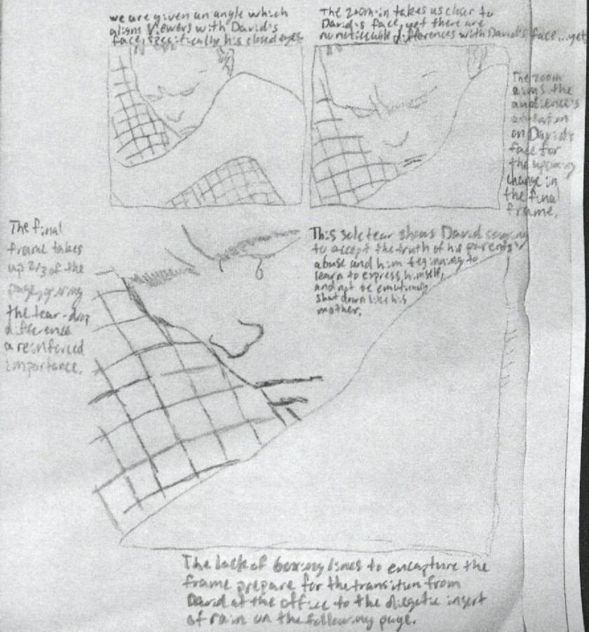
David Small and Tillie Walden’s memoirs reveal defining moments from their childhoods, such as their findings of emotional support and avenues of self-expression outside of the bounds of their families. Small’s “Stitches” contains a page of three panels showing his younger self hugging the leg of his psychologist for comfort. David’s parents were not prone to physically embracing their children, and as such, this moment presents a critical turning point for the young cancer survivor as he finally allows himself to cry over the situation his parents placed him in (for it was his father who gave him cancer, and both chose to hold off on their son’s surgery) as well as find a parental surrogate in the form of his psychologist. The zoom in over the three frames as well as the constancy of David’s image in the first two frames — which changes with a solitary teardrop in the third — ensure that readers take a notice of importance to this transformation, for this is the moment that begins Small’s eventual rise over the trauma of his childhood. Walden’s mother in “Spinning” also offers little to her daughter in the form of compassion when she finds out Tillie is homosexual, and as such the hug between Walden and her cello teacher, Victoria, is similarly critical; since the crux of Walden’s moment lies not in Tillie’s tears and expression of emotion (for young Tillie cries at multiple points, unlike David in his memoir), the framing of five panels keeps both Tillie and her teacher’s faces in view (though Walden’s is more clearly shown so readers see the emotion she is expressing to Victoria), as the object of this page is to demonstrate Tillie finding an individual she can connect with and be comforted by. The tears of the second and sixth panels are only shown in medium shots to grant importance to their embrace, which is shown initially in the first panel’s closeup.
Tracing from “Spinning” by Tillie Walden. The initial closeup of Tillie and Victoria’s embrace highlights the emotional support gained from their close relationship.
The overall contextual patterns of the two memoirs help illustrate why Small chose to use a large, two-thirds-of-a-page filling panel to illustrate his moment of expression as opposed to Walden’s decision to use six evenly-sized panels to portray hers. Small structured his memoir so that each “part” of the graphic novel (as divided and distinguished by “I was…” titles and full-page illustrations) has a clear critical point of his story he wishes to convey; for instance, the first “part” presents the aggressive forms of expression his family possesses in contrast to his expression through sickness. As such, Small presents a large closeup of David’s tear — which is then followed by multiple panels displaying a metaphorical rain representing his resulting outflow of expression and acceptance — to clearly communicate to readers the monumental turning point this moment entails. The “climax” of “Spinning” when Tillie decides to finally quit skating, is purposefully given a display lacking dramatization to correspond with her mother’s uncaring reception of the news. Hilary Chute declares in “Why Comics?” that “auteurist comics … offer the singular intimacy of one person’s vision of the world,” and Walden, in designing her memoir, showcases her own subjective reflection of events by presenting a tale with less clear story beats, which are in tune with young Tillie’s lack of certainty and indecision throughout the graphic novel. As such, her hug with Victoria is presented through evenly sized shots that aim at showing not a singular point of transformation, but rather her appreciation for a common (yet until then, not acquired) display of affection she yearned for, which, along with other moments, helped her grow and eventually decide to quit ice skating.
Tracing from “Stitches” by David Small. The single tear marks a critical moment upon which David begins to express himself in a healthy way and eventually break free from the cruelty he has faced in his childhood.
“Stitches” and “Spinning” portray moments of emotional expression and comforting embrace, and Small’s memoir emphasizes the prior while Walden’s, the later. There is an overarching theme of self-expression in Small’s story, with David’s progress largely marked by finding healthy means of working out and conveying how he feels despite losing his voice. Hence, Small creates frames that present closeups of David’s face, excluding that of his psychologist, so that readers may focus on the eventual tear which is critical to the main character’s arc and transition into obtaining positive gains. Along with agency, Tillie gains critical friends in “Spinning” which help comfort her and positively propel her forward. As such, Walden chooses to keep both Tillie and Victoria in frame throughout most of the page, as well sizing the panels so they represent a “regular” yet priceless moment of care which she longed for.
Bibliography:
Chute, Hilary. Why Comics?: From Underground to Everywhere. Harper Collins, 2019
Small, David. Stitches: a Memoir. W. W. Norton & Company, 2013.
When Tillie Walden, the author of memoir “Spinning,” comes out as homosexual to her friends and family, the young skater’s opening up is not met with much love and support from most, yet her cello teacher, Victoria, offers her acceptance in the following page which I’ve traced and analyzed.
Tracing of a Page from “Spinning” by Tillie Walden
The higher angle of the fourth panel draws our eyes up towards Victoria as Tillie would and the closeup shots of the first, second, and fifth panels maintain a close framing of Tillie’s grateful reaction to her teacher’s acceptance. Medium shots from the waist up (as seen in the fourth and sixth panels) pull back from the emotional intensity in time with the pull backs from embrace the two characters experience, yet the embrace and therefore “connection” between them is kept even in the final frame; Victoria is, and will, be there for Tillie.
I’ve traced out a page of David Small’s memoir “Stitches” for some thorough analysis and selected the scene in which David, with the help of Dr. Harold Davidson, begins to express himself and come to accept the cruel reality of his parents’ abuse.
Tracing of a Page from “Stitches” by David Small
The closeups of David’s face draw attention towards the change in the final frame of a solitary tear, which leads to a metaphorical downpour in the following pages (a transition which the unbounded final panel prepares for). The importance of this scene lies in Small’s transition into expressing his emotions in a healthier way, and as such, the White Rabbit (which represents Davidson, his psychologist), is out of frame for the whole page except for his pants leg which David cries into; the emotional transition Small wanted us to focus on was his own, so the framing ensures a focus on David in this moment.
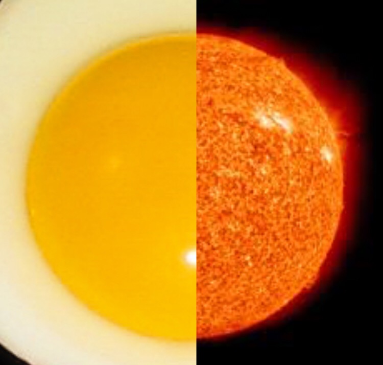
Before I discovered the sunny symmetry between our solar system and a pan-fried breakfast, I was planning on combining the pictures of a sun and a basketball. Thankfully, I did not.
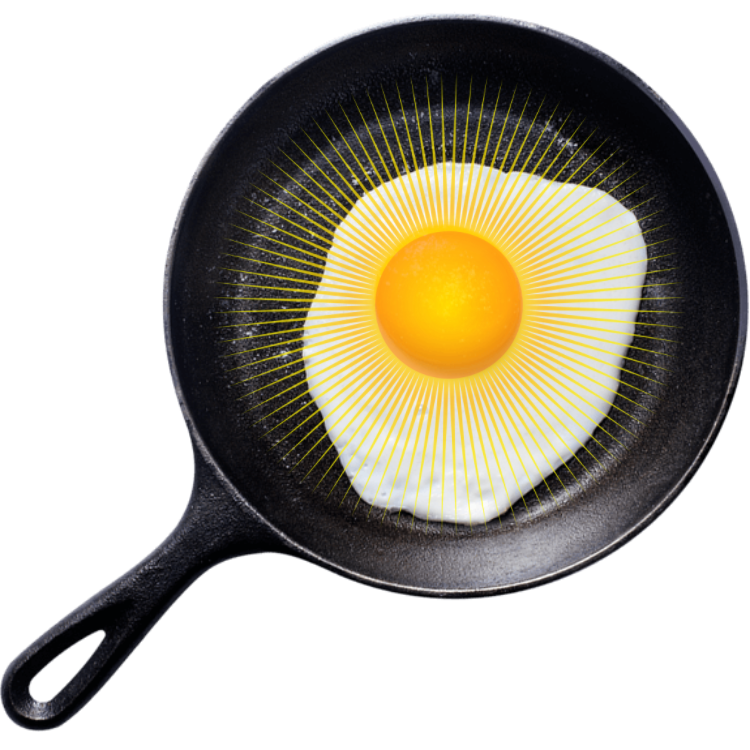
If you’re somewhat familiar with my past online creations (might I introduce you to Pitfalls of Punning and Eggs and Existentialism?), you probably think I have a weird obsession with eggs at this point, but truth be told, I’m not a huge fan of the taste. Waffles and pancakes are far superior in my eyes, but it can’t be denied that eggs have a peculiarly appealing aesthetic value.
Both the sun and the sunny-side-up are yellow(ish) spheres, sources of life’s vitality, and can burn you if you’re not carefully, so they seemed slightly more appropriate to pair than the sun and a basketball. The abrupt contrast between the empty void of space and crispy-warm egg whites creates a humorous disorientation that I rather enjoy. I originally had the sun shrunken down to be nested in the pan, but I had to adapt because of the picture’s square edges; as such, we are now looking at one hefty cosmic breakfast.
Yet I wanted to give you all the opportunity to vicariously hold the world in your hands (or the sun in your pan), so I made a rather unorthodox combophoto that I think you’ll enjoy. Next time you sit yourself down to some scrambles, I hope you contemplate the power you now possess: the ability to cradle the crux of the universe in All-Clads and Calphalons.
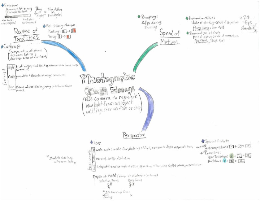
Reworking my film-class notes into a streamlined display of information seemed like an excellent opportunity to prepare a work of academic art for all the world to enjoy, but alas, what I envisioned — a masterpiece filled with factoids and worthy of my professor’s admiration — was no where to be found when I drew the final line.
It’s spot on my page was snagged by a most ugly-looking mash-up of film facts, yet though I fell short of my unrealistic imagination, I have found a few points to be rather proud of: the color examples for post-filming changes and special effects, my use of “range” bars, and one dapper-looking gentlemen holding a camera. The charm of the lastly mentioned stick-figure is obvious, but I will go into more detail concerning the prior items.
First off, the differences between two pairs of processes — tinting vs. toning and rear projection vs. matte work — were a bit difficult to remember, but the color examples I created juxtaposed them against one another and helped me understand which one was which. Furthermore, several other processes contained variations based on the “range” they existed on, and making vertical or horizontal progressions to show where the values laid on each range produced some somewhat useful visualizations.
Even though my notes are no where near the aesthetic excellence of others, they did help me understand what I was reading a bit better. In the future, I plan to draw out examples alongside my future notes instead of creating them on a whole new sheet of paper to make my visualizations more timely than time-consuming, for every minute counts for a college student.
“I hear and I forget. I see and I remember. I do and I understand.” Having meditated on those powerful words by Confucius and completed my visual-notes assignment, I finally know how to understand the confusing contents of a class curriculum: through doodles and stick-figures. Talk about a win-win situation!
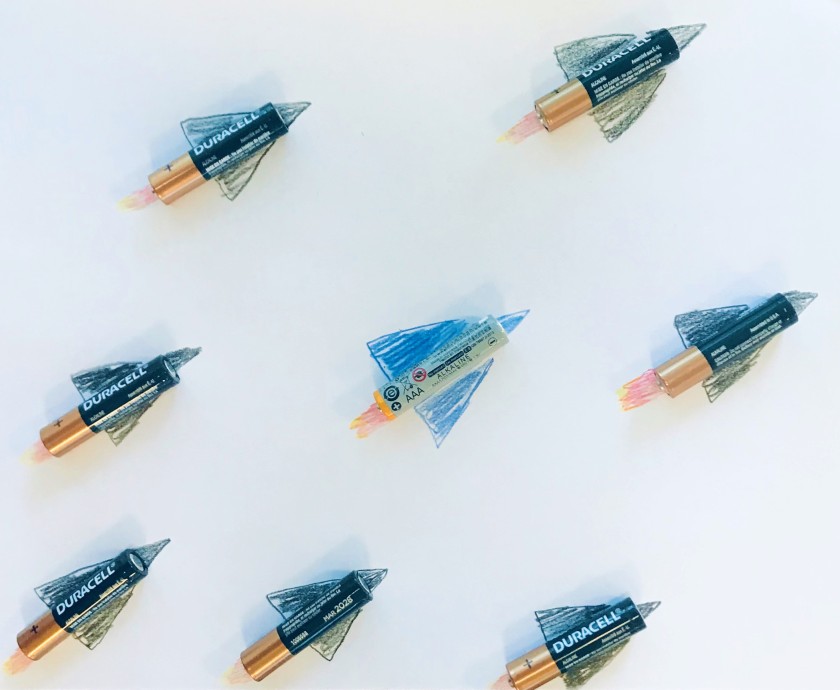
When replacing batteries earlier this morning, I had a spark of inspiration: electric jet planes. So after gathering up a few Duracells and one AmazonBasics, I sat down with some colored pencils and prepared to craft a masterpiece that fired on all cylinders.
Those cylinders, however, must have been feeling the groove of Marcia Griffiths, for they were electric sliding everywhere; I’d place one down with delicate precision, and then another would go for a party ride across the page! It took a long while, but when the stars and batteries aligned at last, I finally began to draw.
First came the flames of fiery yellows and reds, which were closely followed by the wings and cones of our soaring vessels. I know it doesn’t make sense that electric jets have exhaust, but since I myself was exhausted while drawing this, I’m going to chalk it up as a metaphorical discrepancy.
With the batteries in place on my pencil-scratched page, I took out my phone and lined up the shot, and to sum it up in two words, it’s electric!
Traveling in a time machine of self-reflection, I have returned with a few artifacts of my past and created an About Me page (which is titled “my life stuff” because I’m apparently quite extra). Therein lay the books that impacted the impressionable young me, teaching me lessons that are at once profound and pointless; in short, they perfectly applied to life.
Picking out several parts from the cactus of childhood memories has reopened a few wounds, especially the heartache and despair that accompanied those final chapters of Old Yeller — it is an universal truth: all dog books are bad news. Yet those referenced tales have become a part of me in some way, so I guess there’s no use in protesting the pain of a few pages.
I, however, have learned a solemn and sad truth: I am not the reader I once was. My elementary-school self would annihilate me with his AR-test prowess in a second. Yet I shouldn’t be so swift to disparage my present state, for though I may not read as much on my “free time,” I am positively plowing through more pages than my little third-grade mind could ever handle. Thank goodness for this, too, for my lack of progress would have made quite the frightening example of the American school system.
A picture is worth a thousand words, so expect the word count of that page to climb quite quickly as I add in a few extra stick figures here and there. Like the family fridge, it will only display my best drawings, so don’t expect too much.
Today I sat down with my Ticonderoga #2 pencil in hand and gave my first attempt at drawing my website’s banner picture, and despite my history of artistic ineptitude, I nailed it.
The problem, however, was that I made my magnum opus on a sheet of lined paper. I thought there was no way I was going to create a slam dunk of a stick figure on my first go, but lo and behold, I had, and now my handmade masterpiece was tragically unusable and forever marred by four horizontal blue lines.
33 imperfect circles and weirdly drawn eyes later, I finally recreated those exquisite strokes, and this time around, there were no Blue Meanies to be found. I guess lightning does strike twice.
Scribbles by Dean Criser
The resemblance between artwork and artist is uncanny. I, too, have two eyes and a mouth, but more importantly, my portrait possesses the pencil and paper upon which I write. Yes, I may have forgotten the nose, but though my nostrils are absent, my essence is enshrined in this stick figure nonetheless. It’s nothing flashy with a dash of unnecessary exclamation, and that’s me in a nutshell.
This may look like simple stuff, but my ever-constant ability to draw one arm longer than the other was only the start of my troubles in crafting this graphite graphic. Painting apps were partially installed and scanners were both successfully and unsuccessfully used, but in the end I resorted to the questionable image quality of the iPhone camera. Cropping photos of pencil drawings won’t produce the highest of resolutions, but anything looked better than the PDF from that scanner: a gritty, grainy, no-good mistake. In hindsight, a pen would have probably scanned better, but it’s no matter, for through the magic of iPhone filters and clarity edits on the computer, I was able to make my alternative-means masterpiece somewhat presentable.
In a world of prodigy painters and top-notch artists, there’s no way I can use aesthetics to stand out among the myriad of blogs, so hopefully my lack of color or quality catches the attention of one or two someones scrolling through the internet. In the end though, this blog is for fun.
