As far as true stories go, this one’s rather false. The specifics at least are rather contrived, but I guess “the essence” — if I can use that word without being branded pedantic and pretentious — is true … in a way. Also, I definitely bit off a bit more than I could chew with this project, and I was most definitely influenced by the plethora of experimental flicks I had to watch for my FILM 270 class this past week, so looking back on this crazy creation, I don’t know how proud I ought to be; probably a very minuscule amount, if any.
The story I chose to tell, that of a reader noticing the words on the page reflecting his life before his eyes, was chosen primarily from my want to experiment with the growing size of the panels that this project required. The increase in length from Panel 1 to Panel 2 (the visuals appear the same online, but each panel doubles in size as the comic goes along) reminded me of opening a book, and the following increase in height from Panel 2 to Panel 3 mirrored the act of looking up from said book. I tried to make the reflective nature more abstract and slightly more disturbing as the comic goes along, with the plot becoming uncomfortably illogical and peculiar as the panels grew. Furthermore, the final panel shows a mix between the once lower-words and upper images, as if the two sides finally had no choice but to come together as one. I know I have, to put it lightly, artistic limits when it comes to creating clear, complex visuals, so I tried to adapt by accompanying these images with reflective words and making the blurry uncertainty a goal. It kind of got a bit too crazy by the end, but I guess that’s what makes it “The Book of Life.”
The literacy narrative comic assignment was significantly different than the previous assignments. This week’s assignment required meticulous planning and attention to detail. In the first literacy narrative assignment, I did not express properly what I wanted to communicate to the reader. In the first draft of the first literacy narrative assignment, I put more emphasis on my fascination with Game of Thrones than the general process of how I grew as a reader and a writer. I decided to take a different approach to this assignment and focus on the external forces that shaped the way I read and write. The most challenging aspect of constructing my literacy narrative comic was recognizing my rhetorical situation. The set of constraints imposed (a limited number of pages) forced me to omit numerous reading and writing experiences that had a significant impact. The peer-review process played a key role in how my comic was structured. My initial draft focused on my father’s influence on my reading. The plan was to limit the number of panels per page to four, but the feedback I got was to uniformly structure the story so that each moment got its fair share of the spotlight. I employed a visual thinking strategy employed by Drnaso in Sabrina, where close-ups on a screen or letter are utilized which brings out the illusion that the reader is (literally) seeing it from the character’s point of view. David Small, the author of Stitches, influenced the way I drew my father’s facial features and expressions.
I had a rough outline of the story I wanted to tell, but after progressing through a few panels I had a clearer and more specific idea that I wanted to portray on paper. Expressing moments visually allowed me to easily portray scenes I would not have been able to do in a traditional narrative essay. Writing for colleges was a traumatic experience and expressing that experience in the form of a comic allowed me to showcase the way I felt about the experience, how I experienced difficulties with writing, and the nightmares I had about the essays. The literacy narrative comic assignment has forced me to rethink the way I wrote my alphabetical literacy narrative and focus on the moments emphasized in the comic.
I feel that if in an ideal situation the set of constraints were to be eliminated, the story would have had the chance of being developed organically and there would’ve been more insight into my relationship with my parents in terms of reading and the negative effect college essays had on my perception of writing. The end product would have been a comprehensive overview of my transformative experience as a reader and a writer.
My About Me page just got a fresh new coat of paint, so I’d recommend heading on over there if you want to spot this squeaky swordsman among the colorful new collages.
When reworking my literacy narrative, I wanted to create visuals which grabbed readers’ attentions by being bright, bold, and, if I may be so bold, bemusing. Yet there was one small obstacle in my way: the fact that I am not the best of drawers, and cannot convey with a mere pencil and paper my ludicrous ideas sprung from my peculiar imagination. As such, I intermixed my simple stick-figure sketches with several “comic collages,” which I created by throwing a bunch of free-to-use internet images together. Making a digital footprint requires both eye-catching spectacles and a unique identity, and hopefully my use of silly sketches and ridiculous photo-mashups provides an interesting means of telling my story.
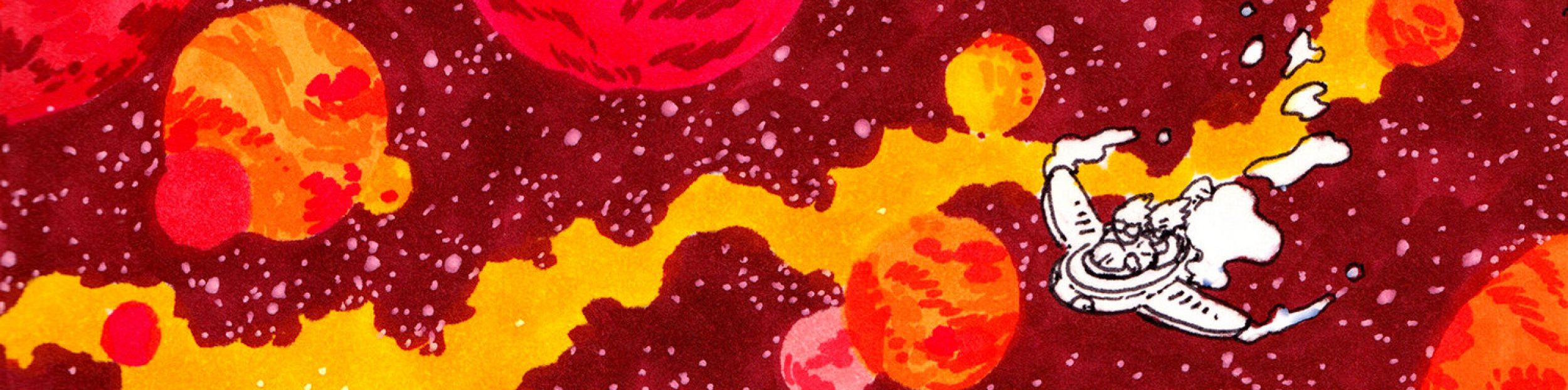
An example of an “explosive” collage
While these collages may seem to be mostly haphazard mashes that took little thought towards staging and framing, I actually did a good bit of planning these out before sitting down at the computer to edit. For instance, all moments of me making positive progress towards my goal of enjoying some books show me moving visually from the left to the right. Meanwhile, whenever some trouble strikes and I lose some love for reading, the agent of detriment or I move right to left. Even though none of my images appear side by side one another, I still wanted the momentum of progress and regression to be consistent throughout the comic.
The old me was quite the harsh critic.
I kept a couple of the images that, when reviewed by my peers in class, garnered favorable reviews and were more easy to understand. One of those, the “Stream of Consciousness” sketch, was run through a photo-editor effect to give a dreamy, watery flow that fits with the subject. This wasn’t something I planned to do beforehand, but rather I stumbled across the effect while cropping it and decided it would serve my story well.
Jewel is indubitably the best character of As I Lay Dying. For all the Darl fans, I’m sorry.
One of the cool aspects of this whole “comic collage” method is how it forces you to be somewhat adaptable towards your original artistic vision. Multiple times throughout this narrative’s creation, I would search for images online to fulfill whatever ideas I had in my head only to find out that no such image exists (at least among those of the public domain). As such, I’d have to select one which, while not my first choice, would either work just as well or even better. For instance, that little clay mouse from earlier was stumbled upon when I couldn’t find a quality non-copyrighted image of the film adaptation of Despereaux, and quite frankly, the clay one is funnier to look at and much more adorable.
Zoom!
Putting these collages together are almost like assembling the pieces of a puzzle, trying to find the right images to work in each panel, a lengthy process in attempting to create the best version possible. Admittedly, it does take a good bit of time, and sometimes a simple drawing would suffice, but I’d like to think the clarity and color gained make it worth the struggle.
The struggle
All in all, I’m very pleased with my colorful comic collages, for they help my life stuff story come to life! And the pun in that previous sentence was most definitely intended.
A Long List of So Many Sources for My Comic Collages:
I am proud of this tale of one enraged customer, but I must admit that coming up with an idea for this quadriptych was a bit more challenging than my triptych. I think this pertains to how easily a triptych can set up a pattern-based subversion of expectations, and the quadriptych’s extra panel would mess up such a joke’s “flow.” Because of this four-panel-box requirement, I had to think a bit outside the box.
After much aimless contemplation, I finally decided on homonym miscommunication as the basis of my comic. Finding the images was not too challenging, but having to slowly zoom in just enough to reveal the “Now Serving Mousse” sign by the third panel presented a bit of difficulty, yet I prevailed after numerous screenshot-crop failures.
To differentiate between the two voices in the comic, I decided to use a bold, all-caps font and sharp-angled speech bubbles for the angry moose and a scratchy scrawl and rounded bubble for the waiter. I had the moose face outwards at the end to give a sense of closure to his movement (as opposed to facing into the comic), and I allowed for the “Mousse” part of the sign to peek out from under his antlers in case readers miss it in the third panel.
All in all, I’m happy with how my comic turned out and look forward to creating more.


.jpg)


