The middle of a semester is always a struggle. One thing that I always do to comfort myself is to say that everything will be good as long as I survive this week. And I will say this every week during that period.
One day, there was this epiphany that I had been doing this not just every week, but every month, every year, and every stage of my life. Life is like climbing a mountain, and there will be small plains after steep ascents, but it will never be the top. It seems that I have been stuck in this recursion. Still, I keep climbing.
Creating a quadriptych comic was a slightly simpler process for me than the triptych assignment. The quadriptych assignment gave me the freedom to add or rather complicate the simplified middle story of the comic. Unlike the triptych comic, constructing the quadriptych comic with one additional panel allowed me to “flesh” out the story more. I wanted to tell a story that emphasizes the idiom “don’t judge a book by its cover” by drawing a stereotypical cartoon character who mistakes a giant monster for a cave. As shown in the quadriptych, the character runs towards what appears to be a cave. The third panel shows the character from inside the “cave” with the jagged edges giving the idea that this is not an ordinary cave. A giant monster can then be seen in the final panel.
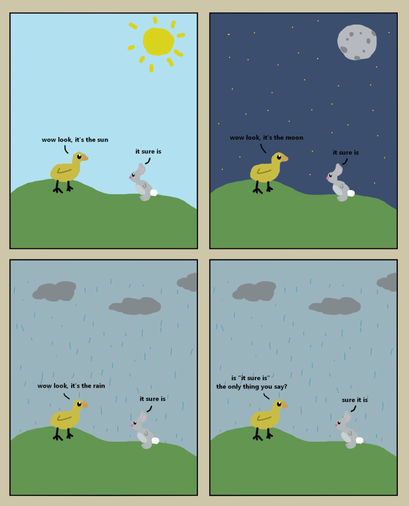
This assignment took me some time to complete, mainly because I had no idea of what to do for the plot. I decided that I wanted it to be funny very early on and began to search online for some comical quadriptychs to give me some inspiration. After pondering for some time alongside doing some other work, still I had no idea of what I wanted my plot to be. I decided to just start drawing anything that came to mind, add some text, and see where that takes me. Luckily for me, this process took me exactly where I wanted and I landed at the final product you see above. It’s fairly simple and the punchline doesn’t come until the end which is something you see often in other comics like this. Initially I had the duck as the sole character, however I soon realized that a story will most likely need another character to push it along. Then I arrived at the rabbit who ended up being the one saying the punchline. This assignment was very similar to the triptych in my opinion, it really just felt like now I had some more room to add slightly more depth and plot to the overall comic. Because of this though, I did enjoy making this one a bit more than the triptych.
I am proud of this tale of one enraged customer, but I must admit that coming up with an idea for this quadriptych was a bit more challenging than my triptych. I think this pertains to how easily a triptych can set up a pattern-based subversion of expectations, and the quadriptych’s extra panel would mess up such a joke’s “flow.” Because of this four-panel-box requirement, I had to think a bit outside the box.
After much aimless contemplation, I finally decided on homonym miscommunication as the basis of my comic. Finding the images was not too challenging, but having to slowly zoom in just enough to reveal the “Now Serving Mousse” sign by the third panel presented a bit of difficulty, yet I prevailed after numerous screenshot-crop failures.
To differentiate between the two voices in the comic, I decided to use a bold, all-caps font and sharp-angled speech bubbles for the angry moose and a scratchy scrawl and rounded bubble for the waiter. I had the moose face outwards at the end to give a sense of closure to his movement (as opposed to facing into the comic), and I allowed for the “Mousse” part of the sign to peek out from under his antlers in case readers miss it in the third panel.
All in all, I’m happy with how my comic turned out and look forward to creating more.
You’ve made a one-panel image with your avatar, combined two images with your combophotos, and made a traditional three-panel comic like those that used to dominate the Sunday funnies sections of newspapers. This week, I’d like you to make a 4-panel comic like the ones that are currently dominating web comics.
As Peter Rubin argues in Wired, “Four-panel strips have been a fixture since early 20th-century newspaper comics like Mutt and Jeff and the concomitant appearance of yonkoma (“four-cell”) manga in Japan. It’s the perfect three-act-structure: You start at one end, develop conflict in the middle two panels, and resolve with a punch line at the end. But thanks to a number of factors—not least of which is the rise of Instagram and Reddit—a gridded, two-by-two variant has come to dominate the internet.” Notice that the four-panel comic, Rubin claims, still has a three-act structure.
Then make your own four-panel square comic. Just like with your triptych, you should still focus on telling a story with a beginning, middle, and end and you are still free to use photographs or to draw in whatever style you’d like. Focus, again, on compact, playful storytelling.
You can combine the four images into a single one or you can publish them to your post as separate images. In order to create a square in the WordPress block structure, you’ll simply need to add 2 “columns” blocks to your post and then hover over the top of each column block to add an image.
Step one: Add a Columns layout block
Step two: Add an image to each block
Column blocks are found in the “Layouts” section of the block selector. They allow you to format your blog posts with columns, to which you can add images or paragraphs of text or embed other elements and so on.
Like with your triptych, add a paragraph of text reflecting on your quadriptych comic. Describe the composition process a little bit. What was challenging about this assignment? How is crafting this sort of comic strip different or similar to the triptych? How was it different to have the middle act stretch across two panels rather than one? Why did you tell the kind of story that you did?