The Secret Language of Comics: Visual Thinking and Writing

A Week in Life of an Emory Scholar

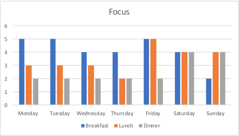
For this Sunday Sketch, I decided to look very closely at how four different factors affected my overall study habits at Emory. I also wanted to know what type of assignments should I complete to varying points during my day to ensure my time is being used effectively. Some tasks require lots of energy and focus while others are more simple and just need some minimal motivation. Therefore, these factors were my levels of Energy, Motivation, Focus, and Productivity. I ranged each element from 1-5, one being very low and five being very high. I then looked at how these levels fluctuated throughout my day and throughout my week and came to some interesting conclusions. 

This research was vital to me because I wanted to see what days and what times during the days would be the most suitable time to work on a particular assignment. For example, based on the data, I can conclude that my peak focus time is during breakfast. Therefore, going forward, I can aim to complete all my readings during the early breakfast time because I know I’ll be able to focus on them. In contrast, it’ll probably be best to achieve my most energy-intensive assignments during dinner time because that’s when my energy levels are typically the highest. I also was able to conclude from my data that the factors that impact my study habits are directly correlated to the number of classes I have on a given day. On Thursday, I have three-morning courses back to back, and they are all very long and rigorous courses. According to my data, I experience some of my lowest energy, focus, and motivation on Thursdays.

If I were to continue this research, I’d collect more data over more days to make my data sets more accurate. On of the judgments I had to make when documenting this data was figuring out what was important enough to record. A lot of factors impact study habits and figuring out which ones to look at were difficult. It was also hard to asses sometimes how I was feeling, and sometimes I felt my level was between two numbers, so I had to pick whichever one I was leaning towards. In another study, I would make the range larger (i.e., 1-10) so that I could obtain a more accurate level.

This project was a valuable tool in allowing me to look at when are the best convenient times to complete different types of tasks. I’m currently in the process of building out my schedule for next semester, and I will be sure to return to this data when scheduling my classes and to manage my workload.

DEPRESSION, DESPONDENCY, AND DEJECTION

The past week, for me, has been pretty depressing. Unlike the other assignments, this Sunday sketch assignment took up a significant amount of time. My goal was to simplistically quantify a subjective quantity, such as depression, based on specific categories. The five categories: loneliness, study/work, talking with family, sleep, hangouts. The results were satisfying, to say the least. The categories selected had a relatively radical influence on depression. Loneliness contributes to depression, while sleep has a neutral effect (because I would usually sleep if I was depressed). Studying, talking with family, and hanging out decreased the effect of depression for me.

I decided to use time as the unit of measurement for the categories, the greater the amount of time the greater the effect that category will have on my depressive mood. After analyzing the data collected from the past week, I could conclude that I have been in a more depressive mood at the end of the week than on weekdays. I chose to visualize the five categories in the form of a timetable as it was easier for me to quantify depression on the final scale. The final scale was a simple bar graph showcasing depression in numerical form.

The project has done a surprisingly good job. If I were to continue with this project in the future, I would’ve continued with it similarly as I did the past week, though, I would add more variables to the equation to bring about more accurate results.

Link to the assignment is here.

Image credits: https://www.theodysseyonline.com/brief-visualization-depression

Data Viz

When I started this assignment a week ago I had a question: Does the amount of time between eating and engaging in academic work effect my productivity? More specifically, should I be making more of an effort to eat before my first class?

Throughout the span of a week I kept track of the time and my perceived productivity and alertness. Some days I wouldn’t eat until a few hours into my academic work. In order to show this I entered the times in negatively. At the end I found that the more time there was between my first bite and the start of my academic day the more productive and alert I felt.

Though it will be difficult to wake up in the morning earlier in order to have time for a bite, I can see that it will be beneficial. And even if I oversleep I will try to have a banana or some sort of quick snack in my room.

What Should I Do Throughout My Day to Play Better Chess?

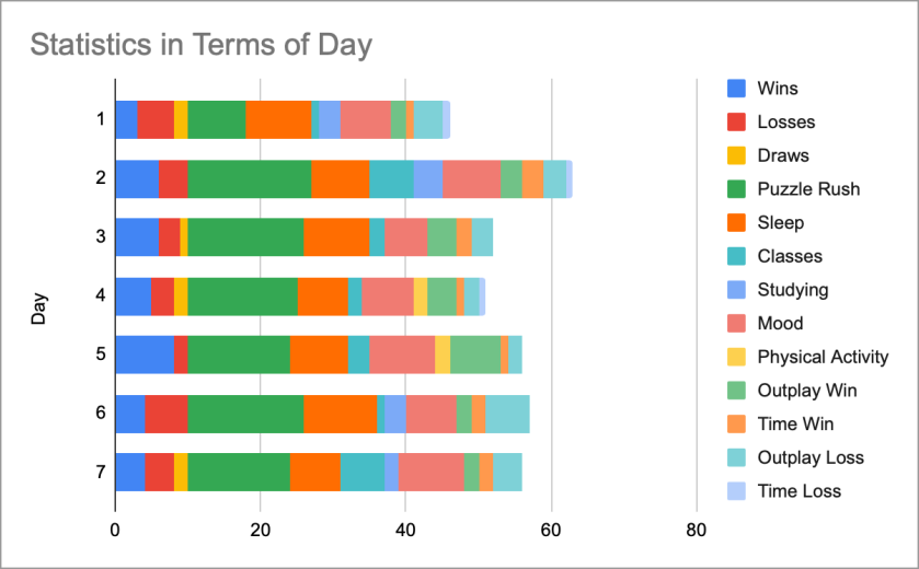
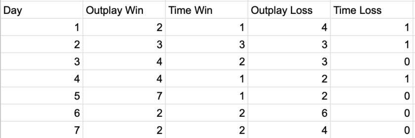
I tried to figure out what things throughout my day impacted how I played chess. I always play about an hour of chess everyday, so I decided to record how many wins, losses and draws I had and the types of games that I played. Sometimes I would win or lose based on an outplay but other times it would end because a player ran out of time. I also recorded how I spent my day and how happy I was to see if there was any correlation.

In terms of results, I found out that I won more games and better games (outplay oriented instead of time oriented) when I studied more, had more classes and had more physical activity. The physical activity makes sense but the studying and classes surprised me. I thought I would be tired of thinking from classes and slack off in chess, but that didn’t seem to be the case. I am also surprised that sleep and mood did not play a huge role for my win loss ratio. I was also surprised that my puzzle rush score (a chess related warm up game that I played before my games) did not correlate with any of the statistics as well.

I was able to answer the question that I asked. What I do throughout my day definitely impacts how I play chess. Rating my day on a scale of 1-10 was super difficult because my mood fluctuates heavily throughout the day and it was hard to find an unbiased point where I could logically rank it. I chose the three graphs as shown below to organize and compare my data. The first two graphs organize the data shown in the charts below. I made the first chart by category as opposed to by day because there were too many categories in play. My third graph is analysis of the data. I made it to compare day by day instead of by category. These visualizations show that I am a very logical person and love ranking things. I am always the type of person to rank just about everything in my day to day life. I think I would go about this experiment similarly; I would just add social interaction with friends. I think there might be some correlation there. In my opinion, this was a very valuable tool for self analysis!

Here is a link to the rubric!

Feeling Fine with Less Screen Time

Question: Does the amount of time I spend on my phone affect my general mood at the end of the day?

In order to answer this question I used my tracked my screen time usage on my phone through the tool in settings and tweaked the data it output in order to make it more informative for me. For example, the program initially classified Youtube as entertainment, but I often use it for studying by watching how-to videos, so I made sure to correct for that in my data when I recorded it every night. Then, right before bed I recorded my overall mood, trying to look at the day and how I felt as a whole. While I recorded short phrases in my notebook every night such as “feeling content, had a decent day,” I found it easier to convey this information in my infographic as simply a smiling, straight, or frowning face.

When analyzing the data that I collected I noticed that total screen time didn’t directly predict my general mood that day. For example, the first Friday and Saturday in the infographic had a similar total screen time, yet on Friday I felt sad and on Saturday I felt happy. On closer analysis I noted that I had spent significantly less time on social media on Saturday than I did on Friday. After noticing this pattern I looked across all my data and noted that of the five days with my lowest screen time spent on social media, I recorded feeling happy for four of those days and feeling neutral for one of them. Furthermore, of the four days with my highest time spent on social media apps, I recorded feeling sad on three of the days and neutral on one of them. This trend leads me to conclude, as one might have already suspected, that extended usage of social media leads to a general decline in mood.

I was somewhat surprised that there was not also an overall correlation between screen time and mood, but when I think more about it, it makes sense that there is not because my phone can be used for both helpful and harmful purposes. One flaw in my infographic is that while I think dividing my mood into good, bad, or neutral helped simplify my conceptual data, it also ignored the nuance of emotional health. If I were to do this again I would also track my mood in a quantitative method such as how many times I felt sad or I laughed, so that I would have more concrete data to back up my assertions.

11 Hours of Sleep is not Productive

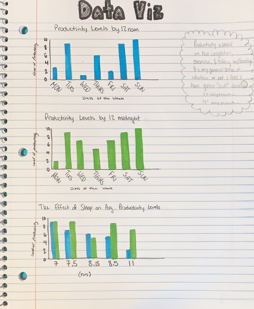
I struggled to determine what and how I would measure this Sunday sketch. After a long process of internal debate, I realized I am most curious about how productive I am day to day, and whether my level of productivity is dependent on how much sleep I get or the time of day. Especially with Spring semester course signup around the corner, it is beneficial to at what time of day I am most productive. What I valued most while collecting data was waking up and counting how many hours of sleep I had gotten. It was nice to have a concrete understanding of how many hours I am getting on average. I also must admit that occasionally the prospect of having to input data on how productive I had been made me want to be a little more productive in times when I typically lack motivation.

My data collection, via notes on my iPhone, is relatively inconclusive. During the past two weeks when the data collection occurred, I was in very different places. I averaged the data between the two weeks, but in reality, I was much happier and energized in the first week and quite sick and fatigued in the second week (hence the 11 hours of sleep!). I also must admit that my definition of productivity was more of a feeling of general accomplishment than a concrete measurement based on hours of work or numbers of assignments completed. I decided to base it on a feeling because that is what I believe affects me more, how I feel about what I have done, not what I have or haven’t done. As I continued to input numbers as the days went by, I began to create something of a base sense of productivity to base my measurements off of.

Once I had all of my data, my next biggest challenge was to show my findings in a simple format. Since I have not been feeling well, I have to be realistic about my ability to focus and must play to my strengths. I am good with pen and paper and unfamiliar with web design, so I decided to stick to my notebook. I have always found bar graphs to be clear and concise and I separated my data into three parts for easy comparision. I found that I am typically more productive in the hours between noon-midnight. I also discovered that I get a similar amount of sleep each night, and when I get much more sleep than normal (11 hours), I am less productive. I wish I could continue this study throughout the year and incorporate more elements such as exercise. I feel that most of my data is relatively similar and heavily relys on my class schedule and health and therefore is not the best indicator of what truly effects my level of productivity.

How does sleep length effect my alertness?

As you can see (hopefully), I constrasted how much sleep I got, the quality of my sleep (how I felt on a scale from 1 to 10 each morning), and the visual of my natural face each morning.

I was pleasently suprised by the results. It seems that I felt better the more sleep I got (given that these are very rounded answers), and that, at least from my perspective, I generally look slightly more awake in the pictures with more sleep/better feeling. But that’s really subjective and it’s hard to be consistent every morning with making sure my face is in a natural, resting position.

This project was hard. At the very start when I heard that we were doing visual data I immediatly thought of comparing how awake I looked when I woke up (through pictures) versus how much I slept (recorded on the app Sleepcyle). I did not put any thought into how I was actually going to present this data. My main query was wondering if you can tell a difference in how alert you look given more or less sleep. When I brought this idea up in class David suggested I keep track of some other data point, so I decided to also record how I felt each morning on a scale from 1 to 10.

In the last couple days I have spent too much time trying to figure out how to show these three data points (one being pictures) on one visual chart/image. I first leaned towards some sort of graph with data points, because I didn’t want to deal with the pictures. So I created an area graph of how much time I spent in bed versus how much time I actually slept (all over how much sleep I got). I thought it looked super boring however, and I still wanted to find a way to include the pictures. Then I moved to a scrolling system where the further down you scrolled on the pictures the more sleep I got. And finally after I got frustrated with the plainness of that idea I settled on putting the pictures themselves on a horizontal timeline.

Even at this point I hadn’t figured out how to incorporate my third variable: subjective quality of sleep (or rather how I felt waking up). I came upon the solution quite by accident. I was dragging my photos into a photoshop file and resizing them so they could all fit on the page when I thought: “wait what if photo size indicated quality of sleep”. From this point on my frustration from this project looked like this:

here is an example of me spending too much time on this assignment

… and thus I came to what I have in that final image/graph/picture collage.

If I were to do this again I would have figured out how I was going to present the data from the start, because I did not choose very presentable data points (or rather… pictures). This didn’t really change the way I looked at my life, but rather affirmed something I could’ve guessed: I look and feel more alert when I get more sleep. But then again, another person could look at those pictures and drawn the same conclusion. It’s hard to differentiate between “very tired” and “tired” in pictures. I also would have recorded more specific sleep length data.

Alright I don’t really know how to end this. I’m tired and I’ve already spent way too long on this project. Please excuse the casual tone of voice throughout this rambling post. Peace out.

(link back to the assignment)

The Cinematic Affect on my Life

For the Sunday Sketch Assignment this week I chose to focus on a very important question- how do movies affect my life? I have quite an unhealthy obsession with movies and this assignment really helped with deconstructing just how severe my love for film is. I watch movies every single day so this week I decided to track what movies I watched, how many hours I spent watching movies and doing work each day, and my overall mood each night. I believe a lot can be drawn from my data and the conclusions made say a lot about who I am and what I enjoy.

It became very clear to me this week that my time spent on watching movies drastically towers over the time I spend working on homework or studying. This may or may not be an issue that I should address. I feel that as long as I have the ability to complete all my necessary work and do well in my classes in the time that I allot for school than I should have the freedom to watch as many movies I want. However, with that being said, I know that I have a tendency to procrastinate and that it would probably be more beneficial to me in the long run if I spent more time doing my work and furthering my education than spending all my time watching movies. Although this may be a negative affect that comes from my love of movies there are a lot of positives ones that I found as well. It’s obvious that watching movies greatly increases my mood. I absolutely love it. The days spent watching more movies and doing less work were definitely my happiest, especially if they were good movies. And the movies I watched this week were all great movies. Which leads my to my last conclusion, I have a fantastic taste in movies. I watched some classic films this week that were all types of hilarious, inspirational, and all around amazing choices. It’s very hard for me to find a movie I don’t like, but this week the movies were above and beyond all my expectations.

The visualization of my data was the trickiest part of this assignment. I wanted to display it in a way that was fun and aesthetically pleasing. I had never made any kind of infographic or needed to display any data in a sophisticated way like this so it was definitely a learning process. I decided to use a varying assortment of colors to make the data pop and use a word cloud, comparative bar graph, and pictorial bars to easily understand all the data I tracked. I had a good time this week learning more about tracking data and how to effectively portray my findings. This was something that was new to me, but it is a vital tool to have for the future. If I were to continue this assignment, I would find a another way that would make tracking my data more easy and accurate. It was a little difficult to remember to record my activities at all times, but the information I discovered was definitely important for the self-analysis of my life at this time. I was glad to have the opportunity to properly answer my posed question. Movies affect everything about my life. They immensely impact my time, my mood, and definitely my studies. This was vital to know because it allows me to adjust my life in order to better accommodate both my long-term goals and present state of health through balancing out my time and making decisions that are better for my overall sense of well-being.

How Healthy Am I?

Variables

  1. How many people do I talk to?
  2. How many calories do I consume?
  3. How much do I sleep?
  4. How many times do I leave my room?

Hypotheses:

  1. Talking to at least 4 people per day is a healthy behavior for me
  2. Consuming at least 1200 calories a day is healthy for me
  3. Sleeping at least 8 hours each night is healthy for me
  4. Leaving my room at least 4 times a day is healthy for me

These hypotheses were created through prior observation. My overall health is based on how social I am, how hungry I am, how tired I am, and how active I am. It has been observed that the levels of these four variables, stated in the hypotheses, are the minimum levels required for optimum health. No differences were observed when I achieved numbers higher than these minimums, but negative consequences were observed when I had levels lower than these minimums. 

Raw Data Table:

Conclusion: 

Based on the data, it can be concluded that I am not a healthy person since I failed to meet the targets for all 4 variables (based on average values). A further study could repeat this method and test the effect that my awareness of my failure to meet the minimum levels has on my health in a different week.

How Productive am I?

This was definilty the most challenging Sunday Sketch I have done so far. Not only coming up with something to track but then also recording it. I spend about an hour trying to do it electronically, before finally deciding to do it on paper.

Productivity is a very general term, so first I decided to define what it meant to me. I defined productivity as making a good use of my time and completing a specific task. That could be many things, like doing my homework or cleaning my room. After that I had 5 categories to track. Those were being productive in class, homework, club work, exercising, and an other thing that was productive.

css.php