The Secret Language of Comics: Visual Thinking and Writing

APPEARANCES CAN BE DECEIVING

Creating a quadriptych comic was a slightly simpler process for me than the triptych assignment. The quadriptych assignment gave me the freedom to add or rather complicate the simplified middle story of the comic. Unlike the triptych comic, constructing the quadriptych comic with one additional panel allowed me to “flesh” out the story more. I wanted to tell a story that emphasizes the idiom “don’t judge a book by its cover” by drawing a stereotypical cartoon character who mistakes a giant monster for a cave. As shown in the quadriptych, the character runs towards what appears to be a cave. The third panel shows the character from inside the “cave” with the jagged edges giving the idea that this is not an ordinary cave.  A giant monster can then be seen in the final panel.

The link to the assignment can be found here.
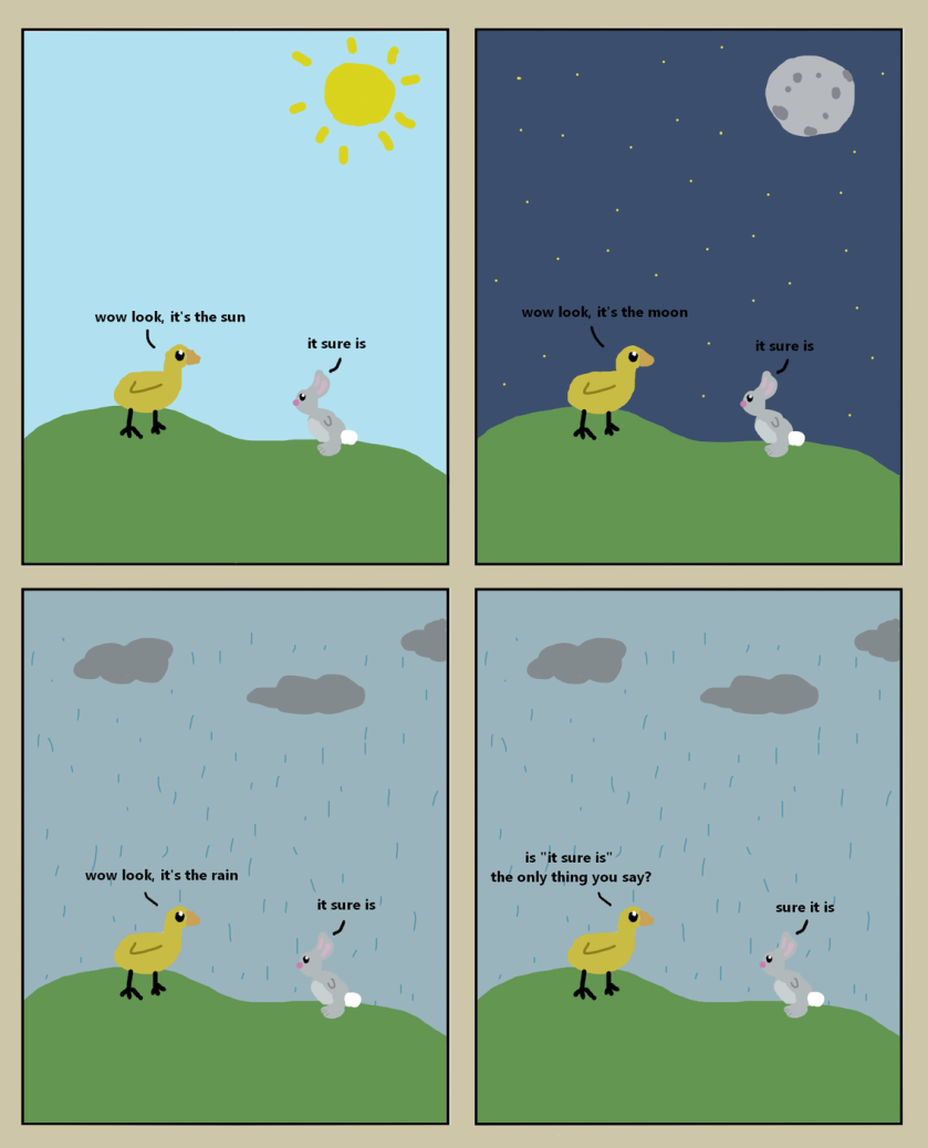
Wow look, it’s a duck and a rabbit.

This assignment took me some time to complete, mainly because I had no idea of what to do for the plot. I decided that I wanted it to be funny very early on and began to search online for some comical quadriptychs to give me some inspiration. After pondering for some time alongside doing some other work, still I had no idea of what I wanted my plot to be. I decided to just start drawing anything that came to mind, add some text, and see where that takes me. Luckily for me, this process took me exactly where I wanted and I landed at the final product you see above. It’s fairly simple and the punchline doesn’t come until the end which is something you see often in other comics like this. Initially I had the duck as the sole character, however I soon realized that a story will most likely need another character to push it along. Then I arrived at the rabbit who ended up being the one saying the punchline. This assignment was very similar to the triptych in my opinion, it really just felt like now I had some more room to add slightly more depth and plot to the overall comic. Because of this though, I did enjoy making this one a bit more than the triptych.

Baked Goods

I am proud of this tale of one enraged customer, but I must admit that coming up with an idea for this quadriptych was a bit more challenging than my triptych. I think this pertains to how easily a triptych can set up a pattern-based subversion of expectations, and the quadriptych’s extra panel would mess up such a joke’s “flow.” Because of this four-panel-box requirement, I had to think a bit outside the box.

After much aimless contemplation, I finally decided on homonym miscommunication as the basis of my comic. Finding the images was not too challenging, but having to slowly zoom in just enough to reveal the “Now Serving Mousse” sign by the third panel presented a bit of difficulty, yet I prevailed after numerous screenshot-crop failures.

To differentiate between the two voices in the comic, I decided to use a bold, all-caps font and sharp-angled speech bubbles for the angry moose and a scratchy scrawl and rounded bubble for the waiter. I had the moose face outwards at the end to give a sense of closure to his movement (as opposed to facing into the comic), and I allowed for the “Mousse” part of the sign to peek out from under his antlers in case readers miss it in the third panel.

All in all, I’m happy with how my comic turned out and look forward to creating more.

Sources:

https://radiopaedia.org/cases/speech-bubble-signhttp://www.downloadclipart.net/browse/17188/speech-bubble-clipart https://www.flickr.com/photos/leighton/94966306/ https://pixabay.com/de/illustrations/icon-klein-isoliert-front-cafe-4423853/

Maybe stick to chocolate next time

When I first started with my quadriptych, I did not know what kind of storyline it was going to turn into. I started with drawing my cartoon man and began wondering what antics he could possibly get into with just four panels. After much deliberation, I recognized the fact that boys are dumb and should often face consequences because of that. Thus, the story of a forgotten anniversary turned hospital trip was formed. This was much different than creating my triptych because I felt as if I was creating my own story rather than just turning an image into a punchline. This type of comic allows room for extra detail because of the fourth panel and that turns the story into more of a process. I enjoyed having the extra panel because I was able to take a closer look into the story and create a more detailed explanation of the plot. This week’s Sunday Sketch assignment, gave me the opportunity to tell a story of mistakes and unfortunate consequences that may follow. The man should’ve remembered his anniversary, but his unpreparedness led him to spending this special day in the bed of a hospital. He really should have just stuck with chocolate.

Hiders and Seekers

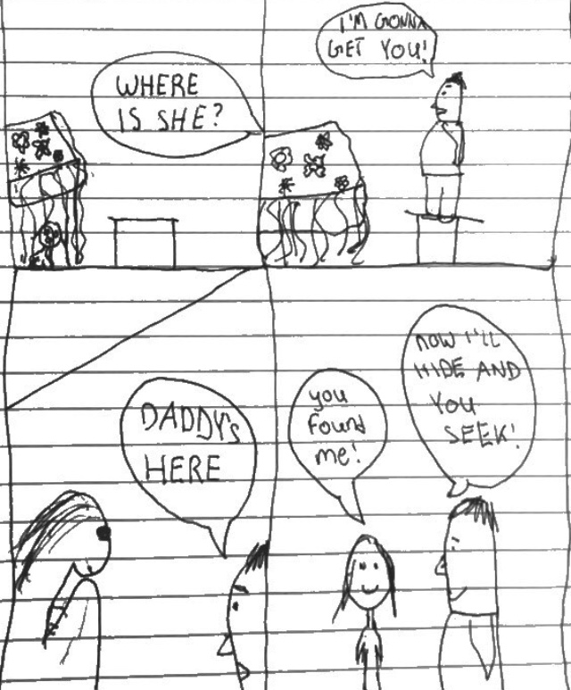
I enjoyed this week’s Sunday Sketch Assignment as much as the triptych assignment that we had two weeks ago. I enjoyed having the freedom to be creative with this assignment. Although this assignment took me more time to complete than previous assignments – I put a lot more thought and care into this one because I knew that I could do something interesting with it. With the triptych there was a clear intention for every panel, but with this quadriptych I had two panels to accomplish the goal of one panel. At first I didn’t know what to do with the extra panel and thought that I could create a better three panel comic than four panel comic. However, once I decided what I was going to draw, I realized that having an extra middle panel would help to emphasize the fear that the female character was feeling and set a nervous tone for the audience. Having this extra panel caused for more surprise when we moved to the final panel, where it is revealed that this is not an abusive situation between a large male and a much smaller female, but is just an innocent game of hide and seek between a father and a daughter.

Do it for the Pic

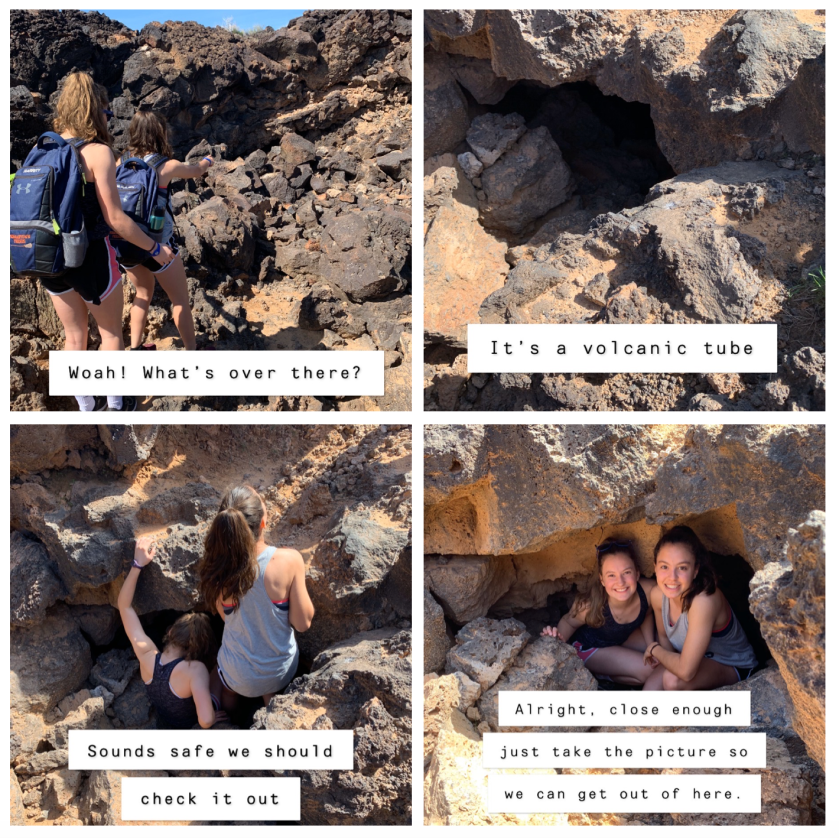
Disclaimer: I would never just “do it for the pic”. My quadriptych process began with me thinking I would draw something, but when I sat down to draw, I had no idea what story to tell. Instead, I decided to once again refer to my camera roll to guide my storytelling. When I came across these photos of my best friend and me hiking during our Spring break lacrosse trip in Nevada, I knew I could make a joke out of the spooky hole in the ground. In the middle two panels, I wanted to do a spin-off of the motif in horror movies in which typically white people make the dumbest decisions and put themselves in imminent danger. In my last panel I changed the theme because even though I did hike underground in the volcanic tubes (which was an amazing experience), it would be too satisfying and underwhelming to show the reader what was inside the tube. The reader wants to know what is down there, lost cities, secret rivers, etc. when it is just tunnels and tunnels of rock formations to that are fun to wiggle through. I chose to go with the theme of my generation’s shallow social media lifestyle where we like to plan entire adventures just to post pictures and make it seem like our lives are cool. Normally, I forget to take pictures, but sometimes the lifestyle catches up to me and I just have to get that one perfect picture. 

This is different than a triptych because I had to create a more concrete storyline which in general made the entire process more difficult. My greatest struggle was putting all of the pictures in a four-square formation because I couldn’t figure out the column format the was recommended in the assignment post

css.php