The Secret Language of Comics: Visual Thinking and Writing

11 Hours of Sleep is not Productive
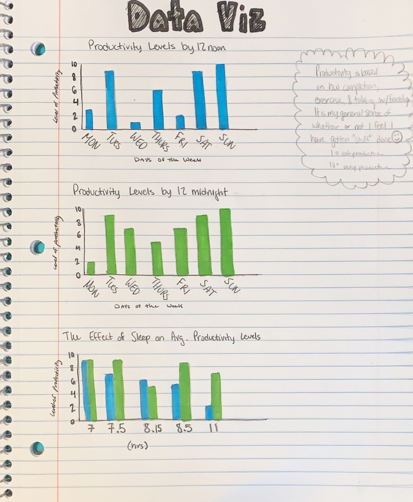
I struggled to determine what and how I would measure this Sunday sketch. After a long process of internal debate, I realized I am most curious about how productive I am day to day, and whether my level of productivity is dependent on how much sleep I get or the time of day. Especially with Spring semester course signup around the corner, it is beneficial to at what time of day I am most productive. What I valued most while collecting data was waking up and counting how many hours of sleep I had gotten. It was nice to have a concrete understanding of how many hours I am getting on average. I also must admit that occasionally the prospect of having to input data on how productive I had been made me want to be a little more productive in times when I typically lack motivation.

My data collection, via notes on my iPhone, is relatively inconclusive. During the past two weeks when the data collection occurred, I was in very different places. I averaged the data between the two weeks, but in reality, I was much happier and energized in the first week and quite sick and fatigued in the second week (hence the 11 hours of sleep!). I also must admit that my definition of productivity was more of a feeling of general accomplishment than a concrete measurement based on hours of work or numbers of assignments completed. I decided to base it on a feeling because that is what I believe affects me more, how I feel about what I have done, not what I have or haven’t done. As I continued to input numbers as the days went by, I began to create something of a base sense of productivity to base my measurements off of.

Once I had all of my data, my next biggest challenge was to show my findings in a simple format. Since I have not been feeling well, I have to be realistic about my ability to focus and must play to my strengths. I am good with pen and paper and unfamiliar with web design, so I decided to stick to my notebook. I have always found bar graphs to be clear and concise and I separated my data into three parts for easy comparision. I found that I am typically more productive in the hours between noon-midnight. I also discovered that I get a similar amount of sleep each night, and when I get much more sleep than normal (11 hours), I am less productive. I wish I could continue this study throughout the year and incorporate more elements such as exercise. I feel that most of my data is relatively similar and heavily relys on my class schedule and health and therefore is not the best indicator of what truly effects my level of productivity.

How does sleep length effect my alertness?

As you can see (hopefully), I constrasted how much sleep I got, the quality of my sleep (how I felt on a scale from 1 to 10 each morning), and the visual of my natural face each morning.

I was pleasently suprised by the results. It seems that I felt better the more sleep I got (given that these are very rounded answers), and that, at least from my perspective, I generally look slightly more awake in the pictures with more sleep/better feeling. But that’s really subjective and it’s hard to be consistent every morning with making sure my face is in a natural, resting position.

This project was hard. At the very start when I heard that we were doing visual data I immediatly thought of comparing how awake I looked when I woke up (through pictures) versus how much I slept (recorded on the app Sleepcyle). I did not put any thought into how I was actually going to present this data. My main query was wondering if you can tell a difference in how alert you look given more or less sleep. When I brought this idea up in class David suggested I keep track of some other data point, so I decided to also record how I felt each morning on a scale from 1 to 10.

In the last couple days I have spent too much time trying to figure out how to show these three data points (one being pictures) on one visual chart/image. I first leaned towards some sort of graph with data points, because I didn’t want to deal with the pictures. So I created an area graph of how much time I spent in bed versus how much time I actually slept (all over how much sleep I got). I thought it looked super boring however, and I still wanted to find a way to include the pictures. Then I moved to a scrolling system where the further down you scrolled on the pictures the more sleep I got. And finally after I got frustrated with the plainness of that idea I settled on putting the pictures themselves on a horizontal timeline.

Even at this point I hadn’t figured out how to incorporate my third variable: subjective quality of sleep (or rather how I felt waking up). I came upon the solution quite by accident. I was dragging my photos into a photoshop file and resizing them so they could all fit on the page when I thought: “wait what if photo size indicated quality of sleep”. From this point on my frustration from this project looked like this:

here is an example of me spending too much time on this assignment

… and thus I came to what I have in that final image/graph/picture collage.

If I were to do this again I would have figured out how I was going to present the data from the start, because I did not choose very presentable data points (or rather… pictures). This didn’t really change the way I looked at my life, but rather affirmed something I could’ve guessed: I look and feel more alert when I get more sleep. But then again, another person could look at those pictures and drawn the same conclusion. It’s hard to differentiate between “very tired” and “tired” in pictures. I also would have recorded more specific sleep length data.

Alright I don’t really know how to end this. I’m tired and I’ve already spent way too long on this project. Please excuse the casual tone of voice throughout this rambling post. Peace out.

(link back to the assignment)

The Cinematic Affect on my Life

For the Sunday Sketch Assignment this week I chose to focus on a very important question- how do movies affect my life? I have quite an unhealthy obsession with movies and this assignment really helped with deconstructing just how severe my love for film is. I watch movies every single day so this week I decided to track what movies I watched, how many hours I spent watching movies and doing work each day, and my overall mood each night. I believe a lot can be drawn from my data and the conclusions made say a lot about who I am and what I enjoy.

It became very clear to me this week that my time spent on watching movies drastically towers over the time I spend working on homework or studying. This may or may not be an issue that I should address. I feel that as long as I have the ability to complete all my necessary work and do well in my classes in the time that I allot for school than I should have the freedom to watch as many movies I want. However, with that being said, I know that I have a tendency to procrastinate and that it would probably be more beneficial to me in the long run if I spent more time doing my work and furthering my education than spending all my time watching movies. Although this may be a negative affect that comes from my love of movies there are a lot of positives ones that I found as well. It’s obvious that watching movies greatly increases my mood. I absolutely love it. The days spent watching more movies and doing less work were definitely my happiest, especially if they were good movies. And the movies I watched this week were all great movies. Which leads my to my last conclusion, I have a fantastic taste in movies. I watched some classic films this week that were all types of hilarious, inspirational, and all around amazing choices. It’s very hard for me to find a movie I don’t like, but this week the movies were above and beyond all my expectations.

The visualization of my data was the trickiest part of this assignment. I wanted to display it in a way that was fun and aesthetically pleasing. I had never made any kind of infographic or needed to display any data in a sophisticated way like this so it was definitely a learning process. I decided to use a varying assortment of colors to make the data pop and use a word cloud, comparative bar graph, and pictorial bars to easily understand all the data I tracked. I had a good time this week learning more about tracking data and how to effectively portray my findings. This was something that was new to me, but it is a vital tool to have for the future. If I were to continue this assignment, I would find a another way that would make tracking my data more easy and accurate. It was a little difficult to remember to record my activities at all times, but the information I discovered was definitely important for the self-analysis of my life at this time. I was glad to have the opportunity to properly answer my posed question. Movies affect everything about my life. They immensely impact my time, my mood, and definitely my studies. This was vital to know because it allows me to adjust my life in order to better accommodate both my long-term goals and present state of health through balancing out my time and making decisions that are better for my overall sense of well-being.

How Healthy Am I?

Variables

  1. How many people do I talk to?
  2. How many calories do I consume?
  3. How much do I sleep?
  4. How many times do I leave my room?

Hypotheses:

  1. Talking to at least 4 people per day is a healthy behavior for me
  2. Consuming at least 1200 calories a day is healthy for me
  3. Sleeping at least 8 hours each night is healthy for me
  4. Leaving my room at least 4 times a day is healthy for me

These hypotheses were created through prior observation. My overall health is based on how social I am, how hungry I am, how tired I am, and how active I am. It has been observed that the levels of these four variables, stated in the hypotheses, are the minimum levels required for optimum health. No differences were observed when I achieved numbers higher than these minimums, but negative consequences were observed when I had levels lower than these minimums. 

Raw Data Table:

Conclusion: 

Based on the data, it can be concluded that I am not a healthy person since I failed to meet the targets for all 4 variables (based on average values). A further study could repeat this method and test the effect that my awareness of my failure to meet the minimum levels has on my health in a different week.

Week Aheads Ahead: 12-13

12 11/12 Sabrina — 101- 157 Literacy narrative, part 2
11/14 Sabrina — 158-204
11/17 No sketch due
13 11/19 Daytripper — Introduction by Craig Thompson, One: 32, Two: 21 (7-56) Halfa Kucha
11/21 Daytripper — Three: 28, Four: 41 (57-104)
11/24 Sketch 10: Tell a True Story

Over the weekend and this week, you should be finishing up your comic literacy narratives and putting together your Halfa Kucha presentations.

Sketches

Note: I revised the schedule slightly to move sketch 10 back one week. There is no sketch due on 11/17, to allow you to focus on your presentations.

In class this week, I’ll hand out sheets of 11×17″ paper that you can fold into 5 “panels” for sketch 10. It’s also fine to do that sketch with 8.5×11″ paper, but with all the folding the larger sheets will likely work better — working with a standard 8.5×11″ page means that your first panel is only about 2″x3″ and that might be a challenge to draw on.

Looking ahead to the Thanksgiving break, you’ll be recreating a scene from a movie … just be sort of thinking about what you might be able to manage to do with that sketch.

Half Kucha

As you read for class this week you should be thinking about and preparing for your presentations. It’s probably a good idea to look back over your Tracing Pages essay as you do so. That assignment asked you to think about trauma and healing by zooming in very narrowly on two pages. This assignment is asking you to think about trauma and recovery from more of a middle distance — looking for patterns across two or three of the books we have read this semester.

In the assignment prompt, I ask you to think about those two quotes from Herman and also the Hillary Chute essay on “The Risk of Representation.” You might think about the quotes from that essay that we worked on as a class.

Some other key ideas you might consider:

  • the ways in which a comics artist “push on conceptions of the unrepresentable” and “assert the value of presence, however complex and contingent”;
  • the ways in which these authors “offer the work of retracing — materially reimagining trauma. They return to events to literally re-view them”;
  • the ways in which these narratives “are not only about events but also, explicitly, about how we frame them;
  • the ways in which an author “insists on the importance of innovative textual practice offered by the rich visual-verbal form of comics to be able to represent trauma productively and ethically”;
  • the idiom of witness: “a manner of testifying that sets a visual language in motion with and against the verbal in order to embody individual and collective experience, to put contingent selves and histories into form”;
  • the ways in which these authors “show us interpretation as a process of visualization”;
  • comics as a “possible metaphor for memory and recollection” in the way that comics “appear in fragments, just as  they do in actual recollection,” especially when you’re dealing with traumatic memory;
  • the ways in which these authors represent “an everyday reality,” especially for women and girls, “picturing what is often placed outside of public discourse”;
  • authors using the “inbuilt duality of the form — its word and image cross-discursivity — to stage dialogues among versions of the self, underscoring the importance of an ongoing, unclosed project of self-representation and self-narration”;
  • the ways in which comics represent time as space: “time is shaped spatially” on a page through panel size, shape, and placement, which interacts with pace and rhythm and allows for “palimpsesting past and present moments together” in order to show the past, present, and future all together simultaneously;
  • the similarities and differences between comics and film, and in particular for this assignment the ways in which comics might be better at representing trauma and healing because comics “cedes the pace of consumption to the reader, and begs rereadings through its spatial form,” thus “releasing its reader from the strictures of experiencing a work in a controlled time frame,” which can have a profound impact when dealing with the ethical implications of presenting traumatic narratives or disturbing images (for example, avoiding the problem of the camera lingering too long on an image of atrocity or “wash over it too casually”);
  • because of comics’ “rhythm of acquisition” they are “capable of taking up complex political and historical issues with an explicit, formal degree of self-awareness”;
  • the ways in which comics can feel diaristic: “there is an intimacy to reading handwritten marks on the printed page, an intimacy that works in tandem with the sometimes visceral effects of presenting ‘private’ images” (all quotes in this list from Chute, Hillary. “Introduction: Women, Comics, and the Risk of Representation.” Graphic Women: Life Narrative and Contemporary Comics. New York: Columbia UP, 2010. 1-27.)

Obviously, you should not try to tackle all of these in your analysis. But you might read through that list and pay attention to one that intrigues you and/or helps you to understand something complex about the books we’ve read this semester, then try to lay out that understanding in your presentation.

How Productive am I?

This was definilty the most challenging Sunday Sketch I have done so far. Not only coming up with something to track but then also recording it. I spend about an hour trying to do it electronically, before finally deciding to do it on paper.

Productivity is a very general term, so first I decided to define what it meant to me. I defined productivity as making a good use of my time and completing a specific task. That could be many things, like doing my homework or cleaning my room. After that I had 5 categories to track. Those were being productive in class, homework, club work, exercising, and an other thing that was productive.

Week ahead: 11

11 11/5 Sabrina — 1-50
11/7 Sabrina — 51-100
11/10 Sketch 9: Data viz from everyday life

This week, we’ll start Sabrina by Nick Drnaso. I think it will feel like a very different book to most of you than any we’ve read so far. Zadie Smith, an author with a long list of awards and commendations, said of Sabrina that it is “the best book — in any medium — I have read about our current moment.” I wonder what you think of that claim, especially in the sense of what is “our current moment” then?

How would you describe the tone of the novel? How about its color palette and visual style? The cartoonist Roz Chast has claimed that Drnaso “gets across a mood that’s very unsettling, in a way that I’ve never quite come across before, at least in graphic novels.” Probably all the of the books we have read this semester have been unsettling in some ways — but how is this one more or less or differently unsettling?

Don’t forget to keep tracking your data for sketch 9 and to put together your visualization of that data. And I will hand out oversized paper in class on Thursday that you can use for your 5-panel true stories in sketch 10.

Groove-o-Meter

To discover just how disco-groovy my week is, I decided to measure how often music is a part of my day-to-day life, and as it turns out, I was boppin’ a whole lot. Eighty-four percent of my week’s hours were spent grooving, which in a way makes sense, for I often use tunes to give myself that motivation to get stuff done.

I decided not to include my morning alarms as music, despite it consisting of a song, since I usually shut it off real quickly anyways. Also, I forgot to record my Wednesday, so I substituted a second Sunday to fill in that final seventh spot. How groovy is my Wednesday? We’ll never know.

Creating the graphic took a rather long time, and in hindsight, I probably should have just drawn it on a sheet of paper. I had to stack multiple images in order to show the full infographic because downloading it was locked behind a subscription fee for infogram.com. Although if you’d like to see the full infographic as one complete image, you can click here.

All in all, I think the Groove-o-Meter does a good job measuring my daily groove, and I am excited to listen to some more bops as soon as I’m done uploading this in 5, 4, 3, 2, 1…

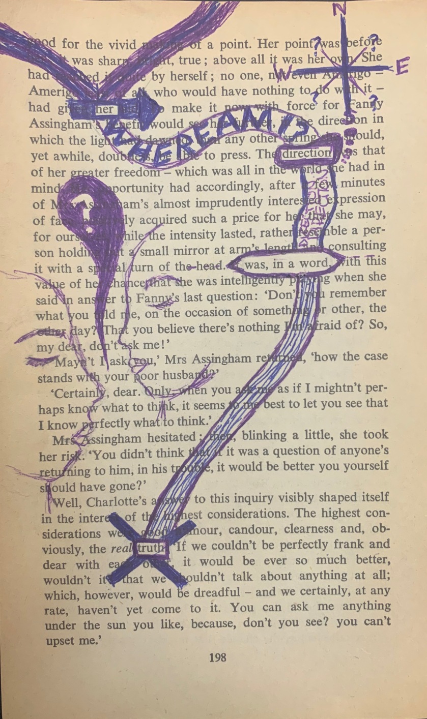
Her Journey

Her

direction

was, in a word,

truth

I really enjoyed making this assignment. I will admit, it took me way longer than I expected for me to actually complete the assignment but once I had finished I was proud of what I made. I started off with 3 separate double sided pages and I was really struggling to find words on a page that flowed well. Each day I would look at one of the pages back and front and try to come up with an idea. After 3 days, I had read through all the papers and hadn’t had a clue what I was going to do.

This all changed when I stopped looking at the assignment as a sort of puzzle, trying to fit pieces together to make up a big picture, but rather a journey, where you follow one word to another. Once I mentally made that decision, I had a much easier time finding the words on the page I wanted to use. From there, I knew exactly what I wanted to draw, a pathway. For one, this pathway symbolizes “her” journey in my story, but it also symbolizes the journey I took to string the words together on the page. From there I added other designs to the page to fill up some of the empty space and finally was able to conquer this assignment!

css.php